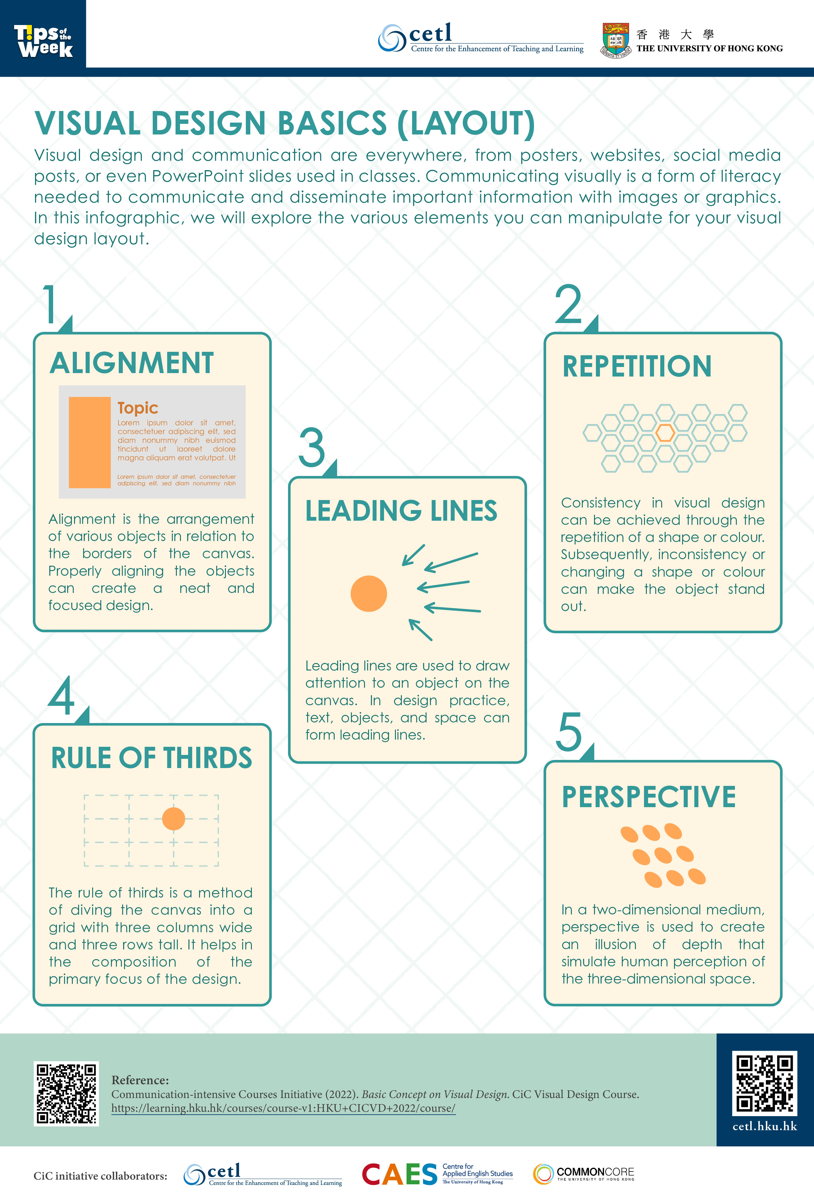
Visual design and communication are everywhere, from posters, websites, social media posts, or even PowerPoint slides used in classes. Communicating visually is a form of literacy needed to communicate and disseminate important information with images or graphics. In this infographic, we will explore the various elements you can manipulate for your visual design layout.
- Alignment
Alignment is the arrangement of various objects in relation to the borders of the canvas. Properly aligning the objects can create a neat and focused design. - Repetition
Consistency in visual design can be achieved through the repetition of a shape or colour. Subsequently, inconsistency or changing a shape or colour can make the object stand out. - Leading Lines
Leading lines are used to draw attention to an object on the canvas. In design practice, text, objects, and space can form leading lines. - Rule of Thirds
The rule of thirds is a method of diving the canvas into a grid with three columns wide and three rows tall. It helps in the composition of the primary focus of the design. - Perspective
In a two-dimensional medium, perspective is used to create an illusion of depth that simulate human perception of the three-dimensional space.
References:
- Communication-intensive Courses Initiative (2022). Basic Concept on Visual Design. CiC Visual Design Course.
https://learning.hku.hk/courses/course-v1:HKU+CICVD+2022/course/


