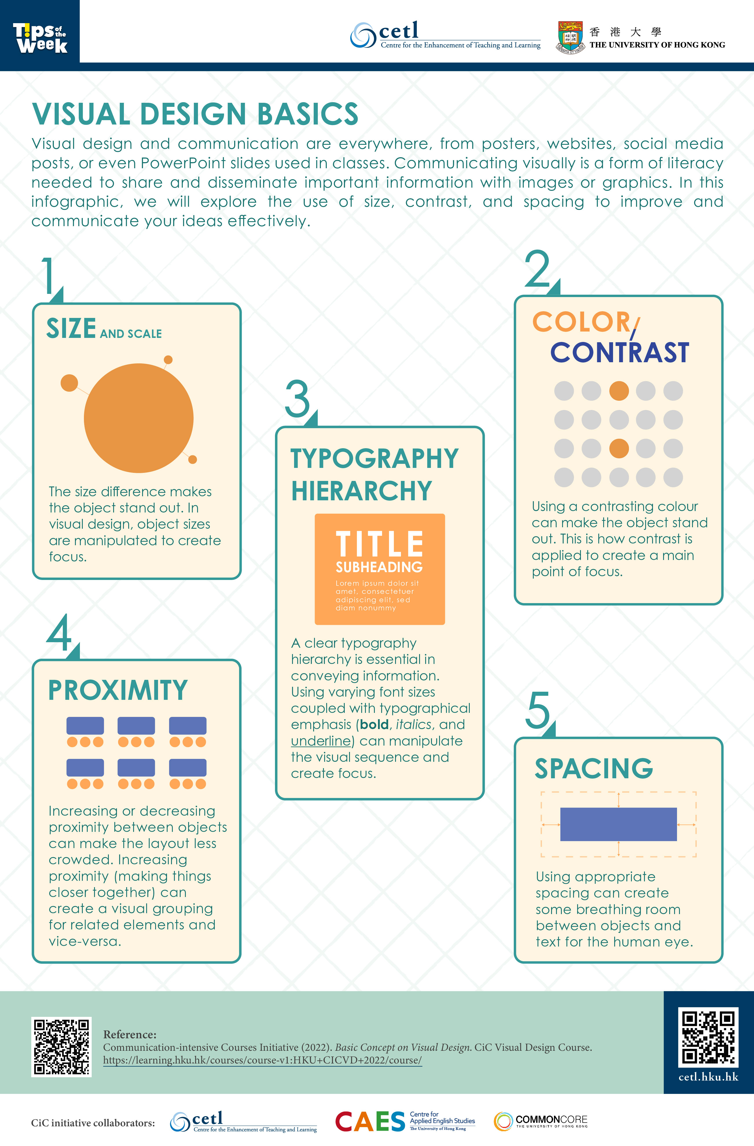
Visual design and communication are everywhere, from posters, websites, social media posts, or even PowerPoint slides used in classes. Communicating visually is a form of literacy needed to share and disseminate important information with images or graphics. In this infographic, we will explore the use of size, contrast, and spacing to improve to communicate your ideas effectively.
- Size and Scale
The size difference makes the object stand out. In visual design, object sizes are manipulated to create focus. - Color / Contrast
Using a contrasting colour can make the object stand out. This is how contrast is applied to create a main point of focus. - Typography Hierarchy
A clear typography hierarchy is essential in conveying information. Using varying font sizes coupled with typographical emphasis (bold, italics, and underline) can manipulate the visual sequence and create focus. - Proximity
Increasing or decreasing proximity between objects can make the layout less crowded. Increasing proximity (making things close together) can create a visual grouping for related elements and vice-versa. - Spacing
Using appropriate spacing can create a breathing room between objects and text for the human eye.
References:
- Reference:
Communication-intensive Courses Initiative (2022). Basic Concept on Visual Design. CiC Visual Design Course.
https://learning.hku.hk/courses/course-v1:HKU+CICVD+2022/course/


